
How to Choose the Perfect Color Scheme for Your Family Photoshoot: Tips from Kat Alora Photography in Clyde
Selecting the right color scheme for your family portrait session is key to creating stunning, timeless images. As an award-winning photography studio in Clyde, Kat Alora Photography understands the importance of family memories and how the right colors can enhance your photos. While there’s no one-size-fits-all formula, these helpful tips will guide you in making the perfect color choices for your family photoshoot.
1. Consider the Location and Season
The location and season of your family photoshoot play a significant role in determining your color scheme. Take the surrounding environment into account:
- Fall Photoshoots: If you’re shooting outdoors during the fall, rich and warm colors work beautifully. Think earthy tones like nudes, forest greens, dark oranges, and browns. These colors reflect the vibrant autumn foliage and create a cozy, natural vibe.
- Summer Photoshoots: For beachside sessions or outdoor shoots in the summertime, opt for brighter colors like pastels, coral, and turquoise. These colors evoke the energy of summer and complement the natural light and ocean hues.
I also recommend exploring Pinterest for inspiration and to create a mood board. It’s a great way to visually communicate your ideas with your photographer!
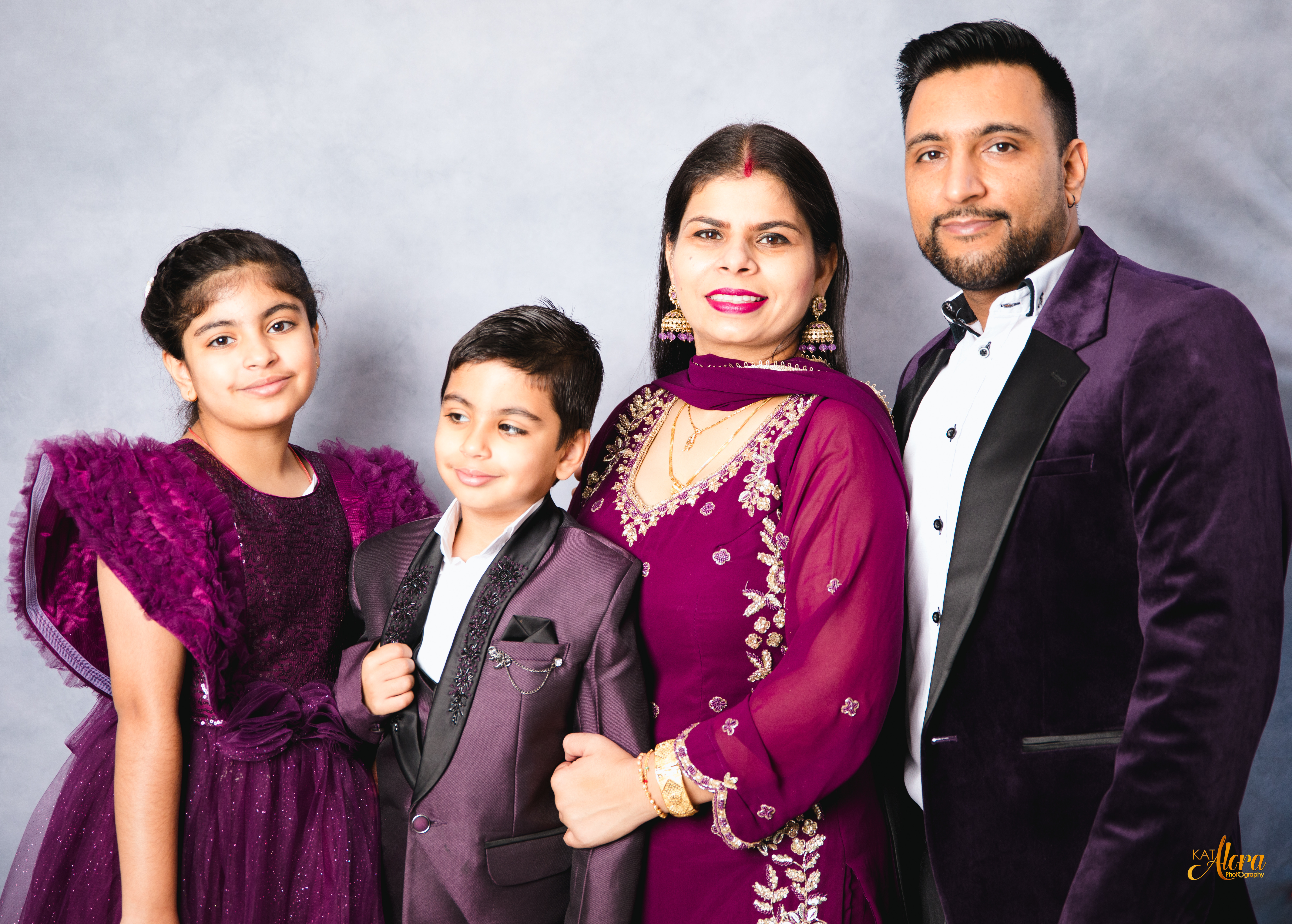
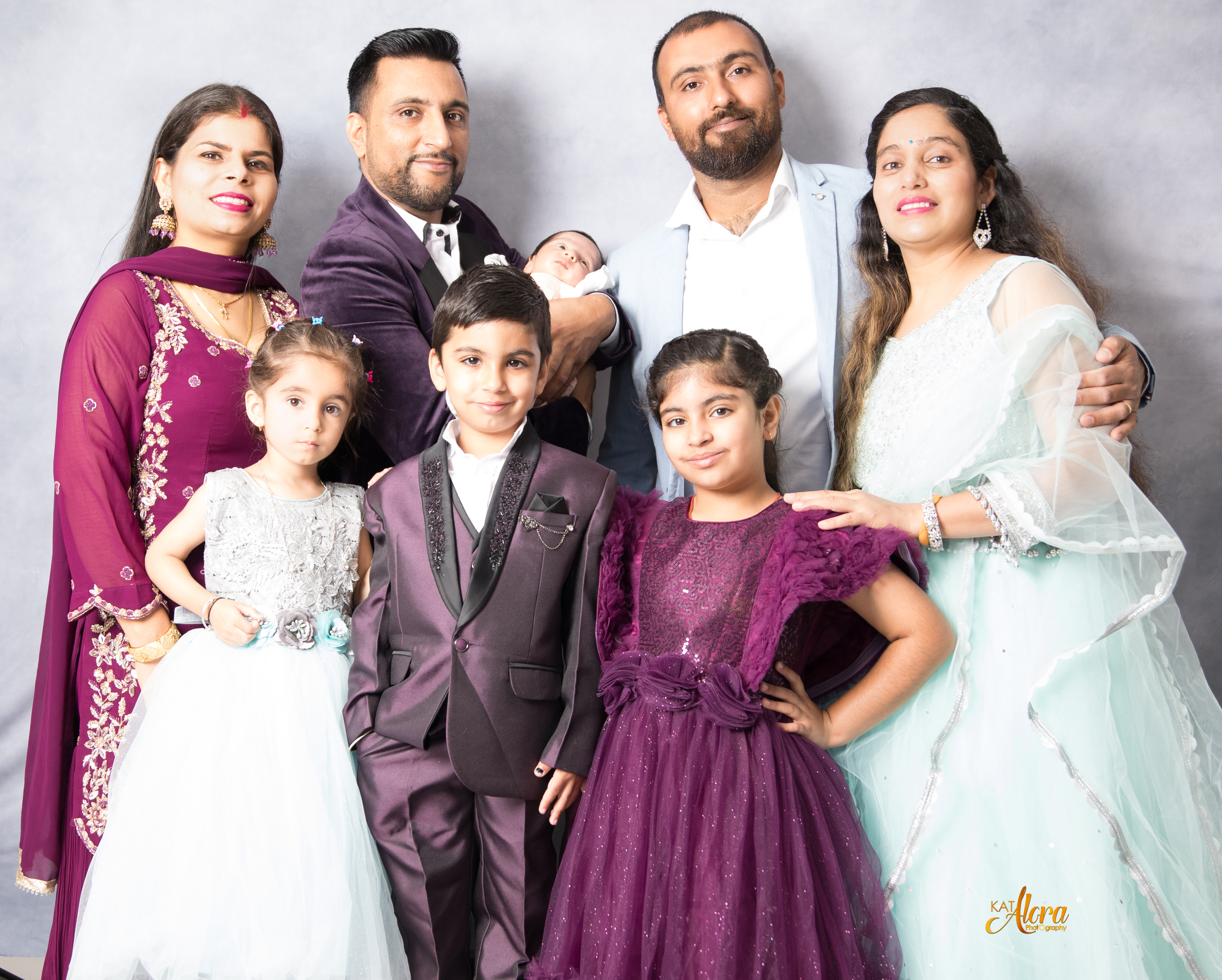
2. Keep It Simple: Stick to Three Main Colors
When planning a family photoshoot, simplicity is key. I suggest sticking to a three-color palette. Choose two to three complementary colors and mix them in different shades and tones. Too many colors can be visually overwhelming and distract from the people in the shot. A cohesive color scheme will help keep the focus on the family, making the photos more engaging.

3. Think About Timeless Colors
While it might be tempting to use trendy colors, remember that fashion trends come and go, but timeless colors remain classic. Neutral shades like beige, gray, black, or white are always safe bets for family portraits. These colors never go out of style and will look just as good years down the line. You can always add a pop of color (like emerald green or deep red) to bring a little vibrancy without going overboard.
4. Add Textures for Depth
Textures can transform an otherwise simple outfit into something more visually interesting. Consider incorporating different fabrics like wool, cotton, or knit for clothing. Accessories like scarves, hats, or blankets can also add dimension and visual appeal to your family portrait. Just make sure the textures complement each other and align with your chosen color scheme for a balanced look.
5. Patterns: How to Incorporate Them Without Overwhelming the Shot
Patterns can be tricky, but when done right, they can add an exciting touch to your family photos. Floral, plaid, stripes, or polka dots can work well if coordinated carefully. Here’s the key to wearing patterns in family photos:
- Coordinate, but don’t match: Pick out the dominant colors in the patterns and match them with solid-colored items.
- Balance the patterns: Avoid clashing patterns. If someone in the family is wearing a bold pattern, balance it out with solid colors to avoid visual chaos.
Patterns can make your photos pop, but they should never steal the show from your family’s personalities!
6. Colors to Avoid for Family Photos
Some colors and patterns may not be the best choice for family photos. While this depends on the theme and location, there are a few general guidelines:
- Avoid neon colors: Neon shades are often too bright and can create harsh lighting reflections in photos.
- Stay away from excessive logos: Logos can be distracting and take away from the timeless feel of your photos.
- Avoid unconventional patterns: Steer clear of overly bold or busy patterns like animal prints or too many clashing stripes. These can be distracting and may not age well in your family portrait.
7. Want to Look Slimmer in Your Photos? Try Dark Solid Colors
If you’re looking to appear more slim or elongated in your family photos, consider wearing dark solid colors like black, navy blue, or dark green. Dark tones have a slimming effect and create a clean, smooth silhouette. Avoid wearing all black, as it can create a shadowy effect. Instead, try combining dark colors with subtle pops of color in your accessories or shoes to add interest.
8. Consider Your Family’s Personal Style
Ultimately, your family photos should represent who you are as a group. Whether you’re all about casual, elegant, or trendy, make sure your outfits reflect your style. Choose colors that make everyone feel confident and comfortable. The more relaxed and natural you feel in your clothing, the better your photos will turn out!
Why Choose Kat Alora Photography for Your Family Portrait Session?
At Kat Alora Photography, we specialize in creating timeless, memorable family portraits that reflect your unique story. Our award-winning studio in Clyde, Melbourne’s southeast suburbs, offers a comfortable, professional setting where we’ll help guide you through the entire process—from outfit choices to color schemes and beyond. We’ve captured countless family moments, and we know how to make every session special.
Ready to Create Lasting Memories with Your Family?
If you’re ready to book your family portrait session with us, we’d love to hear from you! At Kat Alora Photography, we’ll ensure that your session is fun, stress-free, and results in photos you’ll cherish for years.
Contact us today to schedule your family photoshoot in Clyde, Melbourne, and let us capture the magic of your family!